Feel Good. Move Better.
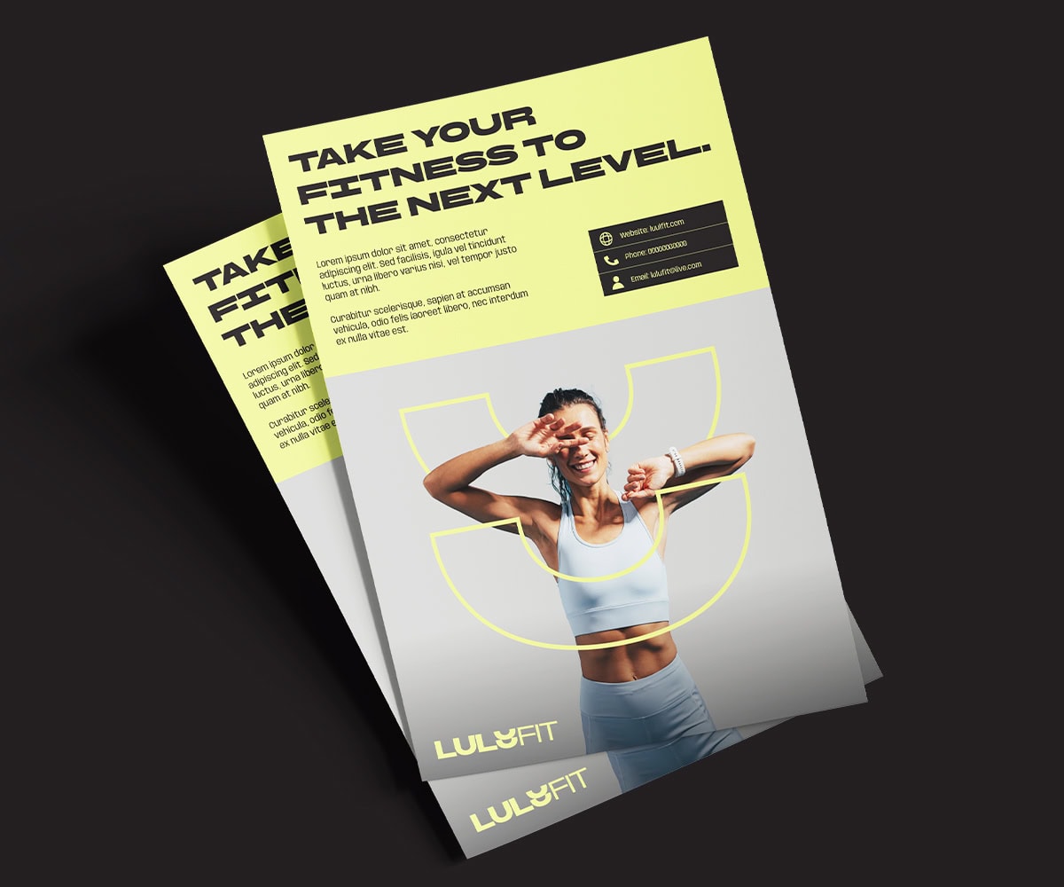
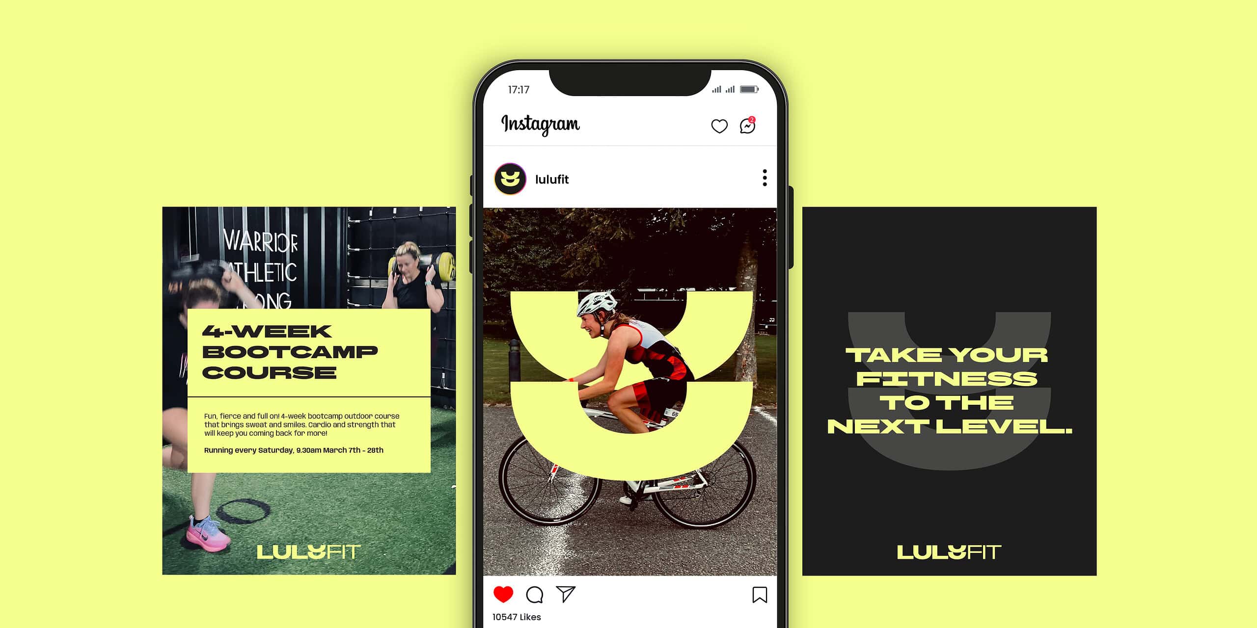
LuluFit is a fitness brand focused on helping people move with confidence, grow in strength and feel empowered in their own journey. Built on honesty, strength and a no-fluff attitude, the brand needed an identity that could clearly express that mindset and stand out across a competitive fitness and wellness space. We were briefed to create a full brand identity for LuluFit, along with key brand applications that could carry the look and feel consistently across digital and physical touchpoints.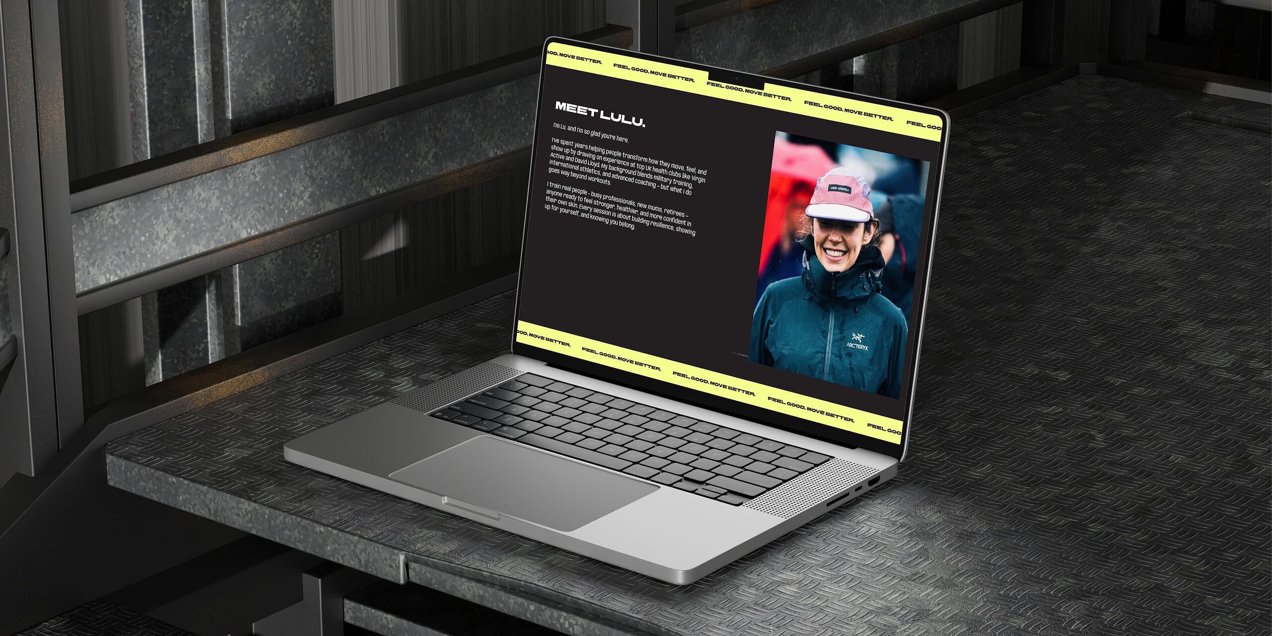
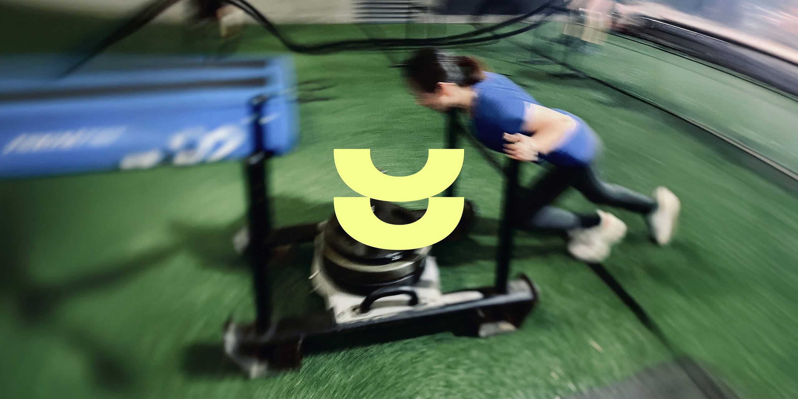
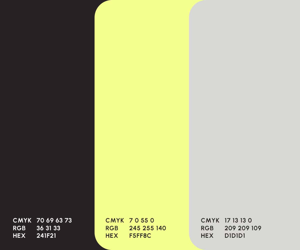
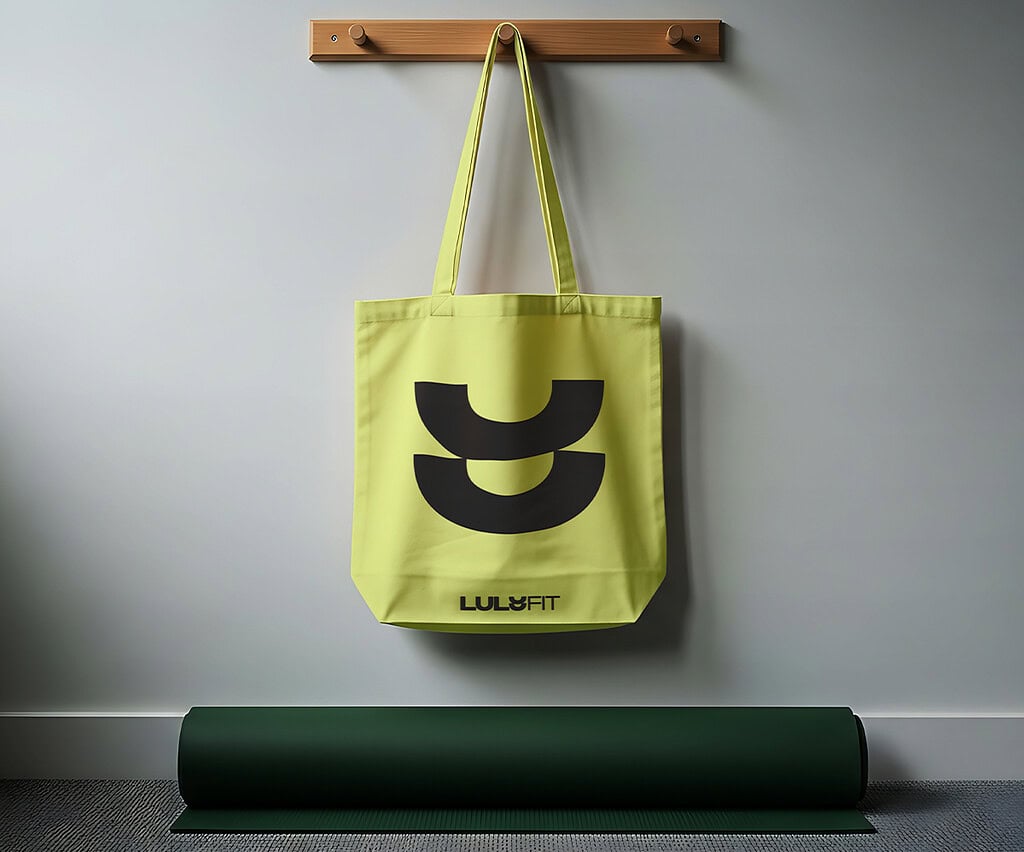
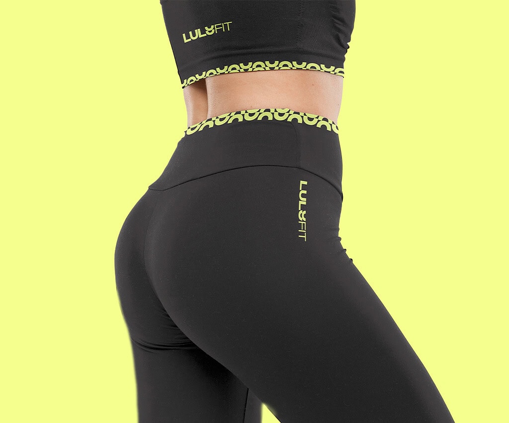
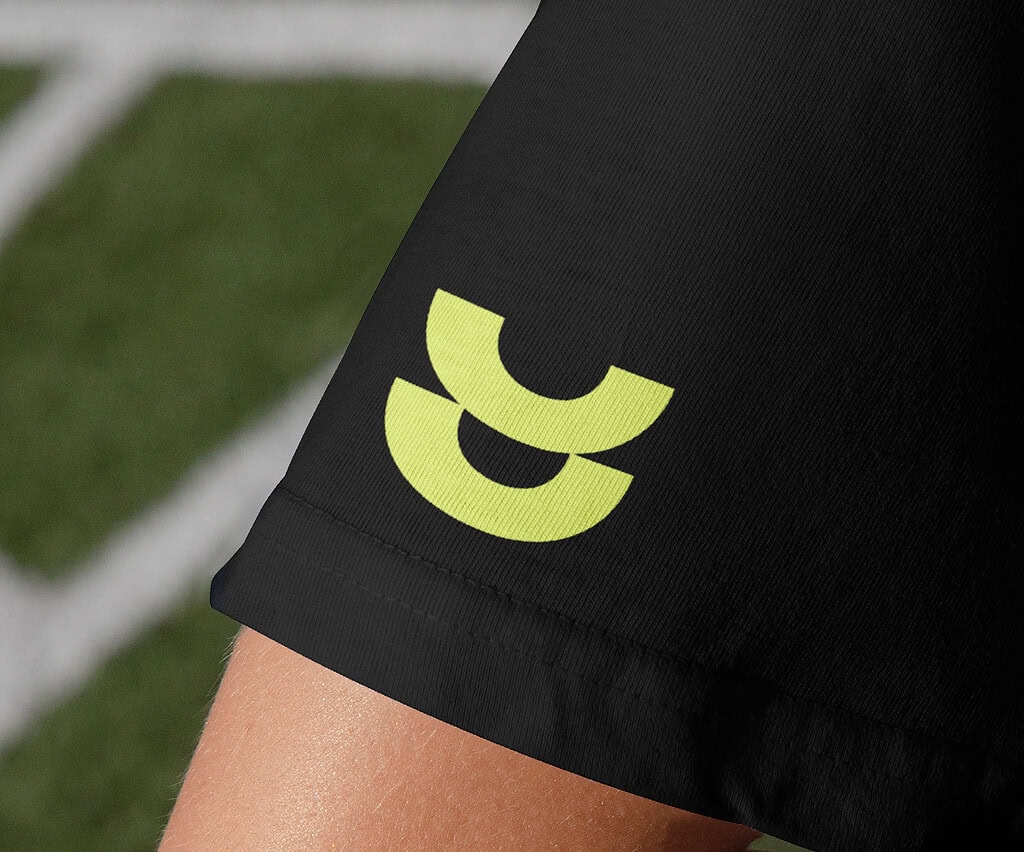
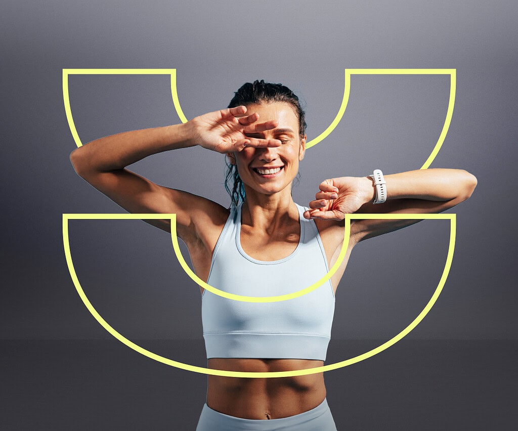
The identity was built around the idea of uplifting and levelling up, both physically and mentally. At the centre of the brand is a distinctive ‘U’ logomark, designed to represent uplift, while also suggesting balance, strength and progression. This shape extends beyond the logo into a flexible graphic device used across the wider identity, helping create a recognisable and energetic visual language. Combined with a vibrant yellow palette, bold typography and strong contrast, the overall brand feels confident, modern and motivating — bringing LuluFit’s empowering personality to life in a way that feels clear, memorable and built to last.